
Testing APIs Using React Components
Turn on suggestions
Auto-suggest helps you quickly narrow down your search results by suggesting possible matches as you type.
Showing results for
- Alfresco Hub
- :
- ACS - Blog
- :
- Testing APIs Using React Components
Testing APIs Using React Components
- Subscribe to RSS Feed
- Mark as New
- Mark as Read
- Bookmark
- Subscribe
- Printer Friendly Page
- Report Inappropriate Content
3 Feb 2017
10:33 AM
Introduction
I've recently been writing some custom clients in order to test out the V1 REST APIs that are available in the 5.2 Alfresco releases in order to provide feedback to the team on areas that can be improved. I've been experimenting with various different UI libraries and frameworks including Vue.js, Aurelia and Angular and have most recently been working with React. When developing anything I always try to follow good coding practices and as such have tried to make the various components that I've built as reusable as possible and have stumbled upon an interesting approach (described in this post) to application composition.
Pre-Requisites
The project is ECM only at the moment so you just need a 5.2 Alfresco Repository (there is no need for enabling CORS, you just need to have the repository started and running locally on port 8080). You'll also need to have Node.js (at least version 6) and NPM (at least version 3) installed. You need to use Chrome (it's only a proof-of-concept so I've not yet included some polyfills that are required for other browsers).
Setup
Getting everything up and running should only take a couple of minutes. You just need to follow these simple steps:
- Download or clone the GitHub repository
- Open a terminal in the project directory
- Run "npm install"
- Run "npm start"
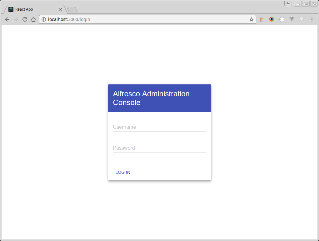
- A new browser tab or window should open at http://localhost:3000 showing the following login page.
The Client
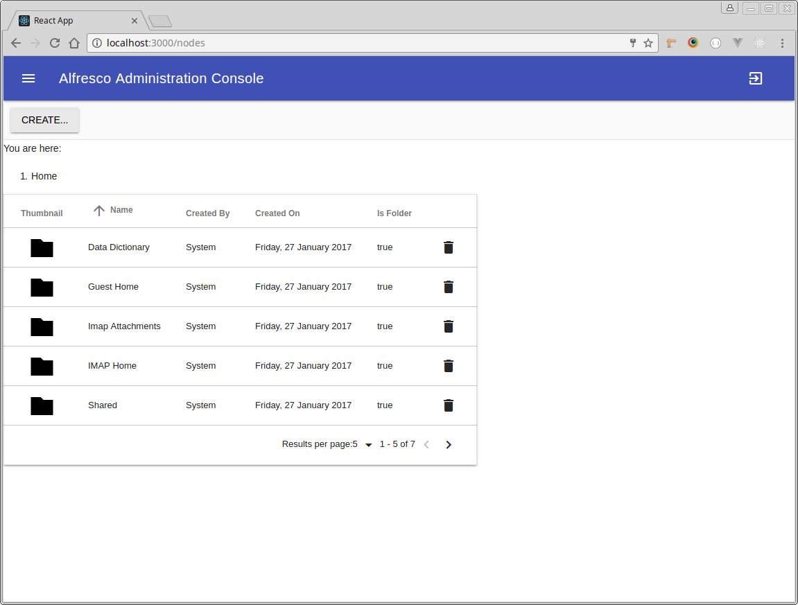
You should be able to gain access to the application by entering valid user credentials for the Alfresco Repository. I'm constantly adding new pages to test out as many of the REST APIs as possible but at the time of writing you should find pages (or "screens" - it is a single page application) for:
- node browsing (table view with drag-and-drop upload)
- node browsing (film strip view)
- node details page (accessed by double-clicking on a file name in the table view of nodes)
- user browsing
- site browsing
- tag browsing
I've intentionally not spent time polishing the design of the client. It is using Material Design Lite to give some basic styling but for the most part I've not done much to any additional styling (for example the upload dialog just shows an overall percentage as a number rather than showing the progress of each individual upload as a progress bar).
The Code
Import the project into your IDE of choice (my preference is Sublime Text 3) and if possible try to ensure that it has appropriate syntax highlighting for JSX (I've used the Babel Sublime plugin for example).
The entry point to the client is src/index.js. This file defines the "routes" for the client:
render((
<Router history={browserHistory}>
<Route path="login" component={Login} />
<Route path="/" component={MainLayout} onEnter={requireAuth}>
<IndexRoute component={Nodes} onEnter={requireAuth} />
<Route path="nodes" component={Nodes} onEnter={requireAuth} />
<Route path="users" component={Users} onEnter={requireAuth} />
<Route path="filmstrip" component={FilmStrip} onEnter={requireAuth} />
<Route path="sites" component={Sites} onEnter={requireAuth} />
<Route path="tags" component={Tags} onEnter={requireAuth} />
<Route path="node/:id" component={NodeDetails} onEnter={requireAuth} />
</Route>
</Router>
), document.getElementById('root'))If you wish to add your own route into the client then this is where you should do it. Each route is a React component and you can find the existing route components in the src/routes folder. Create a new file (i.e. "MyRoute.js") for your own route in this folder and then import it in the index.js file:
import MyRoute from "./routes/MyRoute";...you can then add it as a new client route by inserting it as a new child of the MainLayout route
<Route path="myroute" component={MyRoute} onEnter={requireAuth} />(note the use of requireAuth to ensure that only logged in users can access the route).
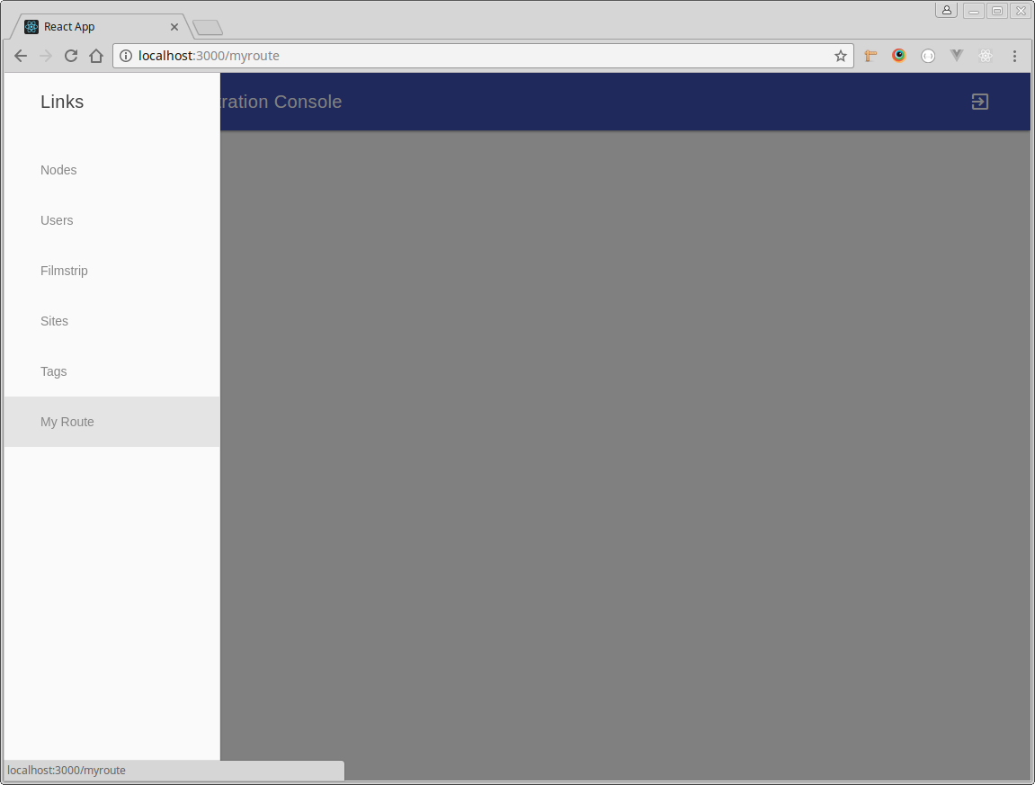
Finally you'll want to add a link to your new page into the navigation drawer. This can be done by editing the src/routes/MainLayout.js file that contains the component that defines the layout for the application:
<Drawer title="Links">
<a className="mdl-navigation__link" href="/nodes">Nodes</a>
<a className="mdl-navigation__link" href="/users">Users</a>
<a className="mdl-navigation__link" href="/filmstrip">Filmstrip</a>
<a className="mdl-navigation__link" href="/sites">Sites</a>
<a className="mdl-navigation__link" href="/tags">Tags</a>
<a className="mdl-navigation__link" href="/myroute">My route</a>
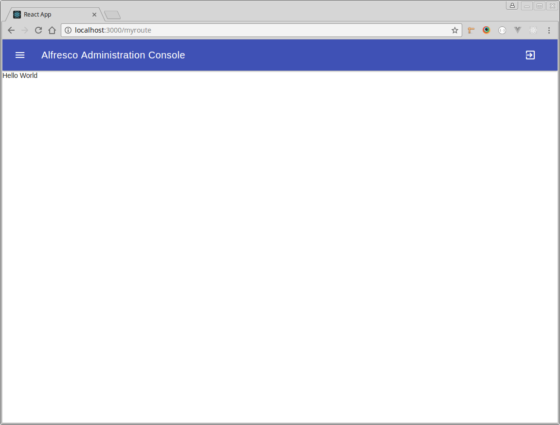
</Drawer>Now add the source code into MyRoute.js to define the component for your new route:
import React from "react";
import Content from "../components/layouts/Content";
const MyRoute = React.createClass({
render() {
return (
<Content>Hello World</Content>
);
}
})
export default MyRoute;Each time you save a file the application should hot-reload so you should see the new link in the drawer:
...and when you click the link it will take you to the new route..
Composing Your Route
The render function in the MyRoute component is one of the React Component lifecycle functions and returns JSX. The great thing about this is that it is possible to mix-and-max JavaScript, HTML and other React Components. This allows you to compose the content of your route in much the same way as you'd write a standard HTML page.
The components that are currently available in the repository have been written to be as re-usable and as flexible as possible. The components can be divided into container and presentation components where the container components are responsible for retrieving and setting data on the Alfresco Repository (via the V1 REST APIs) and setting state that is pushed down through the nested presentation components.
Whilst state is pushed down to presentation components I've taken the approach to use custom native DOM events to bubble actions back up from those presentation components to the container components. This is a slightly different approach than the suggested approach of passing callbacks as properties but does avoid the problem of "drilling holes" to reach deeply nested components.
In practice this means that a presentation component can always communicate with its containing component no matter how deeply it is nested. It also means that the components in between the container and the deeply nested presentation component do not need to be involved or have any awareness of that communication.
The Collection Component
The starting point of many a client is in showing a collection of something... nodes, users, sites, search results, etc. The great thing about the new REST APIs is that they provide a completely consistent way of requesting and receiving data. This means that the same collection component (components/containers/Collection) can be used for any GET REST API that returns a list of items. It also means that you can use the same pagination controls component (components/controls/Pagination) to control the page size and what page of available data is displayed. Common events are defined and exported from the components/containers/Collection.js file that can be emitted by any component nested within a collection to handle:
- new item creation
- existing item updates
- reordering of data (field and/or direction)
- filtering
- navigation and relative path setting
- updating page size
- changing the displayed page
So whether you want to show nodes, users, tags, favourites, sites, whatever you can use the same component.
Single Responsibility Principle
The collection component follows the single responsibility principle in that it is only responsible for retrieving data and it does not deal with how that data is displayed. Instead it handles off that responsibility to other components that can be nested anywhere inside it. This means that the view of the data is completely customizable.
At the time of writing I've provided 3 different data views:
- A table view (components/views/TableView) that relies on nested components to define the structure of that table
- A table view of user data (components/views/UserTableView) that is a component composed of a mixture of HTML and other components
- A carousel view (components/views/Carousel) that relies on nested components to define how each item in the carousel is displayed.
...and you can of course both provide entirely new views or nest existing or custom components within those view components to construct any view that you want with complete freedom. For example compare this example in the sites route:
<Collection url="/api/-default-/public/alfresco/versions/1/sites" relations="containers,members">
<TableView>
<TableViewHead>
<TableHeading label="ID" />
<TableHeading label="Name" />
<TableHeading label="Actions" />
</TableViewHead>
<TableViewBody>
<TableCell property="id"/>
<TableCell property="title"/>
<TableCell>
<Delete url="/api/-default-/public/alfresco/versions/1/sites"></Delete>
</TableCell>
</TableViewBody>
<TableViewFoot>
<TableCell colspan="3" >
<Pagination />
</TableCell>
</TableViewFoot>
</TableView>
</Collection>...with this on in the filmstrip route:
<Collection url="/api/-default-/public/alfresco/versions/1/nodes/-root-/children"
orderBy="name"
include="properties">
<BreadcrumbTrail/>
<Carousel frameHeight="300px">
<Property property="name" navigation={true}></Property>
<Thumbnail renditionId="imgpreview"></Thumbnail>
</Carousel>
</Collection>Note how the same collection component is used (configured with different URLs to access different data) but completely different components are used to compose how the data is displayed.
Custom Rendering and Extension
It's also worth noting in the sites example how a TableCell can easily be used to either render a property of an item or it can simply nest another component like the Delete component to render something completely different (in this case a delete action that prompts for confirmation). It's also worth noting that the exact same Delete component can be used for deleting any item from any collection because of the consistent way in which the REST APIs now handle DELETE operations.
In the Carousel example you'll see that the name of the node is displayed using the Property component. This component could just as easily have been nested inside a TableCell and in fact both components extend the abstract Render component. This is just one example of how it is possible to reuse existing capabilities by extending an existing component. The means that when it is not possible to render data as you'd prefer you can simply create your own component (and optionally choose to extend Renderer if appropriate) and then nest it anywhere within your view.
Hierarchical Freedom
The components are written in such a way that you are completely free to compose them as you wish. For example in the routes/Nodes component you'll see that the TableView is nested within an UploadTarget component. The UploadTarget component provides a target area for dragging-and-dropping files from the operating system to upload into the Alfresco Repository. The key thing here is that it does not need to be nested within a Collection and the Collection does not need to nest it.
You could just add an UploadTarget anywhere on the page so that files dragged-and-dropped onto any of the nested components will be uploaded to the configured location in the Alfresco Repository (you should note that for convenience the url property will be inherited from a parent unless specifically provided).
This freedom also means that it's possible to include BreadcrumbTrail components and Toolbar components into the Collection without any problems - but the benefit is that they can influence the Collection (for example to change the relative path or refresh the list when a new folder is created) by simply emitting on of the registered custom events.
Documentation
I've made an attempt to provide documentation for some of the components using JSDoc. You can build this documentation locally by running:
npm run generate-docs...and you can then browse the documentation by opening the docs/index.html file in a browser.
1 Comment
You must be a registered user to add a comment. If you've already registered, sign in. Otherwise, register and sign in.
Alfresco Content Services Blog
Ask for and offer help to other Alfresco Content Services Users and members of the Alfresco team.
Related links:
Latest Articles
- Alfresco Community Edition 23.2 Release Notes
- Decommissioning of Alfresco SVN Instances
- Summarization of textual content in Alfresco repos...
- ACS containers and cgroup v2 in ACS up to 7.2
- Migrating from Search Services to Search Enterpris...
- Alfresco Community Edition 23.1 Release Notes
- Integrating Alfresco with GenAI Stack
- Achieving Higher Metadata Indexing Speed with Elas...
- ACA Extension Development Javascript-Console & Nod...
- Hyland participation in DockerCon 2023
- Alfresco repository performance tuning checklist
- The Architecture of Search Enterprise 3
- Alfresco Identity Service End of Life
- Using ActiveMQ with Alfresco 7.4
- Offline/parallel re-indexing with ElasticSearch
We use cookies on this site to enhance your user experience
By using this site, you are agreeing to allow us to collect and use cookies as outlined in Alfresco’s Cookie Statement and Terms of Use (and you have a legitimate interest in Alfresco and our products, authorizing us to contact you in such methods). If you are not ok with these terms, please do not use this website.