
3.3 Forms
Turn on suggestions
Auto-suggest helps you quickly narrow down your search results by suggesting possible matches as you type.
Showing results for
- Alfresco Hub
- :
- ACS - Hub Docs
- :
- 3.3 Forms
3.3 Forms
- Subscribe to RSS Feed
- Mark as New
- Mark as Read
- Bookmark
- Subscribe
- Printer Friendly Page
- Report Inappropriate Content
6 Jun 2015
0:40 AM
Obsolete Pages{{Obsolete}}
The official documentation is at: http://docs.alfresco.com
NOTE: This document details the Forms Engine for Alfresco 3.3, for the latest documentation click here.
Table of Contents
Introduction
The Alfresco web client presents 'forms' (data view & entry dialogs) throughout its user interface (DM & WCM). In v2.X, these 'forms' are implemented in multiple ways, from hand-coding JSF to declaring an XSD.
The v3 web client is being built on a web framework that is designed to enable the development of all kinds of web sites (by the wider community). Forms play an important part of web sites and as such the framework needs to provide a convention for implementing them.
The Forms architecture in v3.2 onwards replaces the monolithic and duplicated approach of the JSF property sheet component and xforms.js in v2.X. The same services will be used for both DM and WCM forms, meaning there will be only one configuration syntax and one set of UI controls.
This page describes where and how forms are used and provides details on how they can be configured, this page is therefore aimed at administrators, if you are a developer or are looking to produce customized forms please read the Forms Developer Guide.
Where Are Forms Used?
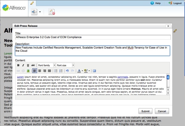
Forms are used heavily in the Share and Web Editor clients, a screenshot from both clients is shown below.
| Form-in-share.jpg | Form-in-awe.jpg |
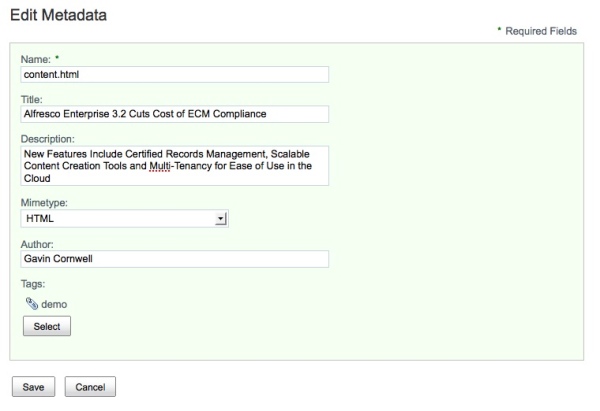
Share now uses the forms engine for the simple and full Edit Metadata pages, the Create Content dialog and Data Lists, some of the underlying forms technology is also used for a majority of the other forms you'll find in Share. The Alfresco Web Editor is focused around the forms engine, forms are used to edit the properties and the content of nodes displayed in a website.
As the contents of the forms are completely driven from configuration, custom types, custom aspects, their properties and their associations can be displayed without a single line of code.
Terminology
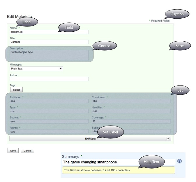
Label
- The label for the field is returned from the server when the form is first requested, the label can be overridden using configuration.
Field
- The field is the area the current value is displayed and allows the user to interact with to change the current value.
Control
- The control is the combination of the Label and the Field, controls are represented by a Freemarker template, and as such can be configured and/or replaced.
Set
- A set is a configured group of fields, that will all be displayed together. The layout of the fields within a set can be overridden using a customized set template.
Set Label
- The label for a set can be configured when defining the set itself
Help Text
- A field can have help text to aid the user when filling in the form.
Form
- A form consists of one or more controls laid out from top to bottom (with the label positioned above the field) and the buttons required to submit the form. A form is in one of three modes, 'view', 'edit' or 'create'. The form layout for each of these modes can be overridden using a customized set template and/or CSS.
Caption
- The caption is the area above the form, by default, when shown, displays the 'Required Fields' instruction.
Configuring Forms
The forms engine generates and renders forms dynamically, configuration is required to manage all aspects of the form i.e what fields should appear in what order and what control should be used to edit the value of the field. The following sections fully explain how forms can be configured, where to place the files and what options are available.
Configuration Files
The default Forms configuration can be found in the file named 'form-config.xml' which can be found in the WEB-INF/classes/alfresco folder when deployed in an appserver. The source file can be found in the root/projects/web-framework-commons/config/alfresco folder. This file contains all the default controls and constraint handlers for the Alfresco content model.
Each application then has it's own form configuration file that defines the forms for the built-in cm:content and cm:folder types, for Share this file is named 'share-form-config.xml' and can be found in the root/projects/slingshot/config/alfresco folder or in WEB-INF/classes/alfresco when deployed to an appserver.
Form configuration should be supplied in a separate file, it is not recommended to change the out-of-the-box files as these modifications will typically be removed when you update your WAR. Each application has it's own extension hook point, for Share the file is named 'share-config-custom.xml', for the Web Editor the file is named 'awe-config-custom.xml' and if you're using the Forms Development Kit a file named 'fdk_config-custom.xml' is searched for.
Regardless of the application the extension file should be placed outside the application, for Tomcat installations (presuming it has been configured to) this means <tomcat>/shared/classes/alfresco/web-extension.
Syntax
The syntax and available configuration options are shown and described below. Attributes within [ and ] are optional, the values within the attributes indicate what type of value is expected.
<config>
   <forms>
      <default-controls>
         <type name='type' template='path'>
            <control-param name='name'>value</control-param>
         </type>
      </default-controls>

      <constraint-handlers>
         <constraint type='id' validation-handler='function' [message-id='key'] [message='string'] [event='string'] />
      </constraint-handlers>

      <dependencies>
         <js src='path' />
         <css src='path' />
      </dependencies>
   </forms>
</config>

<config evaluator='node-type' condition='type'>
   <forms>
      <form [id='string'] [submission-url='url']>
         <view-form template='path' />
         <edit-form template='path' />
         <create-form template='path' />
         <field-visibility>
            <show id='string' [for-mode='view|edit|create'] [force='boolean'] />
            <hide id='string' [for-mode='view|edit|create'] />
         </field-visibility>
         <appearance>
            <set id='string' appearance='fieldset|panel|bordered-panel|title|whitespace|' [parent='string'] [label='string'] [label-id='key'] [template='path'] />

            <field id='string' [label-id='key'] [label='string'] [description-id='key'] [description='string']
                   [help='string'] [help-id='key'] [read-only='boolean'] [mandatory='boolean'] [set='string']>
               <control [template='path']>
                  <control-param name='name'>value</control-param>
               </control>
               <constraint-handlers>
                  <constraint type='id' validation-handler='function' [message-id='string'] [message='string'] [event='string'] />
               </constraint-handlers>
            </field>
         </appearance>
      </form>
   </forms>
</config>
The sections below describe each part of the XML configuration syntax in detail, alternatively, the Forms Development Kit provides several working examples that can be used to learn from.
default-controls
The type element determines which control is used for each data type a field my possess, these can be overridden to allow a different control to be used across all forms, the attributes of the type element are listed and explained below.
- name (mandatory, string): Specifies the data type of the field, for example 'text', form-config.xml contains an entry for each data type supported by the repository.
- template (mandatory, string): Specifies the absolute path to the Freemarker template snippet to use to represent the field.
Parameters can also be passed to the default control via the control-param element, for example if you want all your textfield's to be a certain size. Refer to the control section below for details.
Examples
The example configuration below shows how to set all mltext fields to use the textfield control.
<config>
   <forms>
      <default-controls>
         <type name='mltext' template='/org/alfresco/components/form/controls/textfield.ftl' />
      </default-controls>
   </forms>
</config>
The example below shows how a parameter can be passed to a default control.
<config>
   <forms>
      <default-controls>
         <type name='datetime' template='/org/alfresco/components/form/controls/date.ftl'>
            <control-param name='showTime'>true</control-param>
         </type>
      </default-controls>
   </forms>
</config>
constraint-handlers
The constraint element defines what JavaScript function to use to check that fields with constraints are valid before being submitted, the attributes of the constraint element are listed and explained below.
- type (mandatory, string): Specifies the unique id given to the model constraint in the Alfresco content model, for example 'LIST'.
- validation-handler (mandatory, string): Specifies the name of a JavaScript function that gets called when the field value needs to be validated.
- message-id (optional, string): Specifies the resource bundle key of the string to use when validation fails. If this attribute is present it replaces the default message the validation handler provides and also takes precedence over the message attribute.
- message (optional, string): Specifies the string to use when validation fails. If this attribute is present it replaces the default message the validation handler provides.
- event (optional, string): Specifies what event will cause the validation handler to get invoked, this will be a standard DOM event i.e. 'keyup', 'blur' etc. Defaults to 'blur' if omitted.
NOTE: The forms engine currently checks validation silently so the validation message is never seen, the message and message-id attributes are therefore reserved for future use.
Example
The example configuration below shows how to define a constraint handler for the 'MANDATORY' constraint.
<config>
   <forms>
      <constraint-handlers>
         <constraint type='MANDATORY' validation-handler='Alfresco.forms.validation.mandatory' event='keyup' />
      </constraint-handlers>
   </forms>
</config>
dependencies
The dependencies element defines the list of JavaScript and CSS files required by any custom controls being used in the application. In order for valid XHTML code to be generated the dependencies need to be known ahead of time so the relevant links can be generated in the HTML <head> section.
The js element represents a JavaScript file to be loaded whereas the css element represents a CSS file to be loaded. The attributes of both elements are listed and explained below.
- src (mandatory, string): Specifies the absolute path from the root of the web application (not including the web application context) of the resource to be loaded.
Example
The example configuration below shows how to load a custom JavaScript and CSS file.
<config>
   <forms>
      <dependencies>
         <css src='/fdk/accordion/accordion.css' />
         <js src='/fdk/accordion/accordion-min.js' />
      </dependencies>
   </forms>
</config>
form
The form element, as the name would suggest, represents a form to display. If the form element exists within a config element that provides an evaluator and condition the form will only be found if the item being requested matches the condition. If the form element exists within a config element without an evaluator and condition the form is always found, this is useful if you want a certain field to appear on EVERY form in your application.
The attributes of the form element are listed and explained below.
- id (optional, string): Specifies an identifier for the form, thus allowing multiple forms to be defined for the same item, the form configuration without an id attribute is considered the 'default form'.
- submission-url (optional, string): Allows the action attribute of the generated form to be overridden so that the contents of the form can be submitted to any arbitrary URL.
view-form
The view-form element allows the default Freemarker template that auto generates the form UI in 'view' mode to be overridden, the attributes of the view-form element are listed and explained below.
- template (mandatory, string): Specifies the absolute path to the Freemarker template to be used when the form is in 'view' mode. If this element is present the field-visibility element is effectively ignored and therefore does not have to be present.
For details on how to implement a custom view form please refer to the Forms Developer Guide.
Example
The example configuration below shows how to supply a custom view form template.
<config evaluator='node-type' condition='cm:content'>
   <forms>
      <form>
         <view-form template='/path/to/your/custom/view-form.ftl' />
      </form>
   </forms>
</config>
edit-form
The edit-form element allows the default Freemarker template that auto generates the form UI in 'edit' mode to be overridden, the attributes of the edit-form element are listed and explained below.
- template (mandatory, string): Specifies the absolute path to the Freemarker template to be used when the form is in 'edit' mode. If this element is present the field-visibility element is effectively ignored and therefore does not have to be present.
For details on how to implement a custom edit form please refer to the Forms Developer Guide or see the Forms Development Kit for a working example.
Example
The example configuration below shows how to supply a custom edit form template.
<config evaluator='node-type' condition='cm:content'>
   <forms>
      <form>
         <edit-form template='/path/to/your/custom/edit-form.ftl' />
      </form>
   </forms>
</config>
create-form
The create-form element allows the default Freemarker template that auto generates the form UI in 'create' mode to be overridden, the attributes of the create-form element are listed and explained below.
- template (mandatory, string): Specifies the absolute path to the Freemarker template to be used when the form is in 'create' mode. If this element is present the field-visibility element is effectively ignored and therefore does not have to be present.
For details on how to implement a custom create form please refer to the Forms Developer Guide.
Example
The example configuration below shows how to supply a custom create form template.
<config evaluator='node-type' condition='cm:content'>
   <forms>
      <form>
         <create-form template='/path/to/your/custom/create-form.ftl' />
      </form>
   </forms>
</config>
field-visibility
The children of the field-visibility element define which fields are going to appear on the form, unless a custom template is used as explained in the previous sections.
The rules for determining whether a particular field will be shown or hidden are as follows:
- If there is no field-visibility configuration (show or hide tags) then all fields are visible in all modes.
- If there is one or more hide tags then the specified field(s) will be hidden in the specified modes. All other fields remain visible.
- As soon as a single show tag appears in the config xml, this is taken as a signal that all field visibility is to be manually configured. At that point, all fields default to hidden and only those explicitly configured to be shown (with a show tag) will actually be displayed.
- Show and hide rules will be applied in sequence with later rules potentially invalidating previous rules.
- Show or hide rules which only apply for specified modes have an implicit element. e.g. <show id='name' for-mode='view'/> would show the name field in view mode and by implication, hide it in other modes.
show
The show element specifies a field that should appear on the form, the attributes of the show element are listed and explained below.
- id (mandatory, string): Represents the unique identifier for a field, for example 'cm:name'.
- for-mode (optional, comma separated string): Specifies when the field should appear, valid values for the attribute are 'view', 'edit' and 'create'. If the attribute is not specified the field will appear in all modes, if present the field will only appear for the modes listed, for example to only show a field in view and edit modes the for-mode attribute would contain 'view,edit'.
- force (optional, boolean): There are fields that may be optional for an item i.e. by default they may not be returned by the server. When set to 'true' this attribute informs the FormService that it should do everything it can to find and return a definition for the field. An example might be a property defined on an aspect, if the aspect is not applied to the node a field definition for the property will not be returned, if force is 'true' it would indicate that server needs to try and find the property on an aspect in the content model.
Example
The example configuration below shows how to display some common properties from the Alfresco content model.
<config evaluator='node-type' condition='cm:content'>
   <forms>
      <form>
         <field-visibility>
            <show id='cm:name' />
            <show id='cm:title' force='true' />
            <show id='size' for-mode='view' />
         </field-visibility>
      </form>
   </forms>
</config>
hide
The hide element normally comes into play when multiple configuration files are combined as it can be used to hide fields previously configured to be shown, the attributes of the hide element are listed and explained below.
- id (mandatory, string): Represents the unique identifier for a field that should not be shown, for example 'cm:name'.
- for-mode (optional, comma separated string): Specifies which modes the field should not appear, valid values for the attribute are 'view', 'edit' and 'create'. If the attribute is not specified the field will never appear, if present the field will be hidden for the modes listed, for example to hide a field in view and edit modes the for-mode attribute would contain 'view,edit'.
Examples
The example configuration below shows how to hide the cm:title and cm:description properties.
<config evaluator='node-type' condition='cm:content'>
   <forms>
      <form>
         <field-visibility>
            <hide id='cm:title' />
            <hide id='cm:description' />
         </field-visibility>
      </form>
   </forms>
</config>
The example configuration below shows how to hide the cm:title property from just the edit form i.e. it will still appear in view mode.
<config evaluator='node-type' condition='cm:content'>
   <forms>
      <form>
         <field-visibility>
            <hide id='cm:title' for-mode='edit' />
         </field-visibility>
      </form>
   </forms>
</config>
appearance
The children of the optional appearance element define the look & feel of the controls that make up the form.
The configuration of what fields are present (field-visibility) and how they appear has been separated to provide the maximum flexibility, although maybe slightly more verbose, the separation allows the appearance to be defined for fields that are not explicitly mentioned within the field-visibility element.
set
The optional set element provides the ability to group fields, attributes of the set element are listed and explained below.
- id (mandatory, string): Specifies a unique identifier for the set that other set definitions and fields can refer to.
- parent (optional, string): Allows sets to be nested, the value should reference the identifier of a valid set definition previously defined.
- appearance (optional, string): Specifies how the set will be rendered, currently the supported allowable values are 'fieldset', 'panel', 'bordered-panel', 'title' and 'whitespace'. If an appearance attribute is not supplied the set will not be rendered, whereas if it is set to '' (empty string) the set will be rendered, but without any decoration.
- template (optional, string): Specifies the absolute path to the template to be used when the set is rendered, allowing the layout of the set's fields to be customized.
- label-id (optional, string): Specifies the resource bundle key of the string to use for the set's label, this attribute takes precedence if the label attribute is also present.
- label (optional, string): Specifies the set's label.
If neither the label-id and label attributes are supplied the value of set's id attribute is used as the label.
A default set with an id of '' (empty string) is always present, any fields without an explicit set membership automatically belong to the default set. The default set will be displayed with a label of 'Default'.
Examples
The example configuration below shows how to define a set of fields that will be rendered using a bordered panel and a label of 'Dublin Core'.
<config evaluator='node-type' condition='cm:content'>
   <forms>
      <form>
         <appearance>
               <set id='dublin-core' appearance='bordered-panel' label='Dublin Core' />
               <field id='cm:publisher' set='dublin-core' />
               <field id='cm:contributor' set='dublin-core' />
               <field id='cm:type' set='dublin-core' />
               <field id='cm:identifier' set='dublin-core' />
               <field id='cm:dcsource' set='dublin-core' />
               <field id='cm:coverage' set='dublin-core' />
               <field id='cm:rights' set='dublin-core' />
               <field id='cm:subject' set='dublin-core' />
            </appearance>
      </form>
   </forms>
</config>
The example configuration below shows how to define a set of fields that will be rendered using a custom Freemarker template and who's label is retrieved from a resource bundle using the key 'set.label.dublincore'.
<config evaluator='node-type' condition='cm:content'>
   <forms>
      <form>
         <appearance>
               <set id='dublin-core' template='/fdk/templates/custom-set-dublincore.ftl' label-id='set.label.dublincore' />
               <field id='cm:publisher' set='dublin-core' />
               <field id='cm:contributor' set='dublin-core' />
               <field id='cm:type' set='dublin-core' />
               <field id='cm:identifier' set='dublin-core' />
               <field id='cm:dcsource' set='dublin-core' />
               <field id='cm:coverage' set='dublin-core' />
               <field id='cm:rights' set='dublin-core' />
               <field id='cm:subject' set='dublin-core' />
            </appearance>
      </form>
   </forms>
</config>
The example configuration below shows how to set the appearance and label of the default set.
<config evaluator='node-type' condition='cm:content'>
   <forms>
      <form>
         <appearance>
            <set id='' appearance='panel' label-id='form.set.general' />
         </appearance>
      </form>
   </forms>
</config>
field
The field element allows most aspects of a field's appearance to be controlled from the label to the control that should be used, the attributes of the field element are listed and explained below, the child elements, control and constraint-handlers are explained in the next two sections.
- id (mandatory, string): Specifies the field to be customized, the field id, however, does not have to be present within the field-visibility element.
- label-id (optional, string): Specifies the resource bundle key of the string to use for the field's label, this attribute takes precedence if the label attribute is also present.
- label (optional, string): Specifies the field's label.
- description-id (optional, string): Specifies the resource bundle key of the string to use for the field's tooltip, this attribute takes precedence if the description attribute is also present.
- description (optional, string): Specifies the field's tooltip.
- help-id (optional, string): Specifies the resource bundle key of the string to use for the field's help text, this attribute takes precedence if the help attribute is also present.
- help (optional, string): Specifies the field's help text.
- read-only (optional, boolean): Informs the form UI generation template whether the field should be rendered as editable when the form is in 'edit' or 'create' mode.
- mandatory (optional, boolean): Marks the field as mandatory, this will add a mandatory validation handler to the form so that the form can only be submitted once all data has been provided. A required field marker will normally be rendered as well. Note that if a field is returned from the server marked as mandatory, setting this attribute has no effect, the field will always be mandatory.
- set (optional, string): Specifies the id of a previously defined set. If the attribute is omitted the field belongs to the default set.
If neither the label-id or label attributes are provided the field label returned from the FormService is used.
If neither the description-id or description attributes are provided the field description returned from the FormService is used, this could also be empty, in which case no tooltip will be present.
If either the help-id or help attributes are provided a '?' icon is rendered at the end of the field that will reveal the help text when clicked. Fields that have a constraint applied (except regular expression constraints) automatically get help text applied with an indication of what the user needs to enter.
Examples
The example configuration below shows the label and description of the cm:name field being overridden.
<config evaluator='node-type' condition='cm:content'>
   <forms>
      <form>
         <appearance>
               <field id='cm:name' label='File Name' description='The file name of the content' />
            </appearance>
      </form>
   </forms>
</config>
The example configuration below shows the label and description of the cm:name field being overridden where the values are retrieved from a resource bundle.
<config evaluator='node-type' condition='cm:content'>
   <forms>
      <form>
         <appearance>
               <field id='cm:name' label-id='label.name' description-id='description.name' />
            </appearance>
      </form>
   </forms>
</config>
The example configuration below shows the cm:author field being overridden to be read-only.
<config evaluator='node-type' condition='cm:content'>
   <forms>
      <form>
         <appearance>
               <field id='cm:author' read-only='true' />
            </appearance>
      </form>
   </forms>
</config>
The example configuration below shows the cm:author field being overridden to be mandatory and to have help text available.
<config evaluator='node-type' condition='cm:content'>
   <forms>
      <form>
         <appearance>
               <field id='cm:author' mandatory='true' help-id='help.author' />
            </appearance>
      </form>
   </forms>
</config>
control
The control element allows the default control being used for the field to be replaced, the attributes of the control element are listed and explained below.
- template (optional, string): Specifies the absolute path to the Freemarker template to use to represent the field.
The control-param sub-elements provide a mechanism to pass parameters to control templates, this template could either be the one defined locally or the template defined as the default control for the type of field. The attributes of the control-param element are listed and explained below.
- name (mandatory, string): The name of the parameter to pass to the control template
The value of the parameter is defined as a child text node of the control-param element. It is implemented this way, as opposed to being an attribute, for future expansion, for example, the value could be large, contain line breaks or even structured XML.
Examples
The example configuration below shows the default control for the cm:title property being overridden.
<config evaluator='node-type' condition='cm:content'>
   <forms>
      <form>
         <appearance>
            <field id='cm:title'>
               <control template='/org/alfresco/components/form/controls/textfield.ftl' />
            </field>
         </appearance>
      </form>
   </forms>
</config>
The example configuration below shows how to change the number of rows the cm:description field displays.
<config evaluator='node-type' condition='cm:content'>
   <forms>
      <form>
         <appearance>
            <field id='cm:description'>
               <control>
                  <control-param name='rows'>10</control-param>
               </control>
            </field>
         </appearance>
      </form>
   </forms>
</config>
The example configuration below shows how to configure the richtext control for the cm:description property using the 'full' preset.
<config evaluator='node-type' condition='cm:content'>
   <forms>
      <form>
         <appearance>
            <field id='cm:description'>
               <control template='/org/alfresco/components/form/controls/richtext.ftl'>
                  <control-param name='editorAppearance'>full</control-param>
               </control>
            </field>
         </appearance>
      </form>
   </forms>
</config>
constraint-handlers
If fields have constraints associated with them the default behaviour i.e. what validation handler to call, what event invokes validation etc. is governed by the global constraint-handlers element. The constraint-handlers element within the field element allows aspects of the constraint to be overridden for a particular field.
The configuration syntax used to override the constraint for a field is exactly the same as used for the global constraint-handlers element.
Example
The example configuration below shows the mandatory validation handler being overridden for the rma:reviewPeriod property.
<config evaluator='model-type' condition='dod:recordCategory'>
   <forms>
      <form>
         <appearance>
            <field id='rma:reviewPeriod'>
               <constraint-handlers>
                  <constraint type='MANDATORY' validation-handler='Alfresco.forms.validation.rmVitalRecordPeriodMandatory' />
               </constraint-handlers>
            </field>
         </appearance>
      </form>
   </forms>
</config>
Configuring Controls
The controls section explained how controls are configured for fields, this section covers what controls are available and the parameters they support.
association.ftl
The association control is used to allow objects in the repository to be picked and ultimately associated with the node being edited. The control uses the JavaScript Alfresco.ObjectFinder component to allow the user to browse the repository and pick objects.
The parameters this controls supports are listed and explained below.
- compactMode (optional, boolean): Determines whether the picker will be shown in compact mode
- showTargetLink (optional boolean): Determines whether a link to the document details page will be rendered to content items
authority.ftl
The authority control is used to search for users and/or groups in the repository.
The parameters this controls supports are listed and explained below.
- compactMode (optional, boolean): Determines whether the picker will be shown in compact mode
category.ftl
The category control is used to allow the user to select categories for the node being edited. The control uses the JavaScript Alfresco.ObjectPicker component to allow the user to browse the category hierarchy
The parameters this controls supports are listed and explained below.
- compactMode (optional, boolean): Determines whether the picker will be shown in compact mode
checkbox.ftl
The checkbox control renders a standard HTML checkbox control.
The parameters this controls supports are listed and explained below.
- styleClass (optional, string): Allows a custom CSS class to be applied to the checkbox
content.ftl
The content control renders an input area appropriate for the mime type of the content. Plain text content is shown in a standard textarea whereas rich text content i.e. HTML is rendered in a TinyMCE control, the list of mime types considered to be plain and rich content are configurable (see below). If the mime type of the content is not recognized the control is automatically hidden. The content control is also only rendered when the form is in 'edit' or 'create' mode.
The parameters this controls supports are listed and explained below.
- rows (optional, int): The number of rows the textarea will have (when editing plain text content)
- columns (optional, int): The number of columns the textarea will have (when editing plain text content)
- styleClass (optional, string): Allows a custom CSS class to be applied to the textarea (when editing plain text content)
- editorAppearance (optional, string): The preset set of configuration options to use for the TinyMCE control (when editing rich text content), accepted values are 'full', 'explorer', 'webeditor' and 'custom'. If ommitted a default configuration is used
- editorParameters (optional, string): Used when the 'custom' preset is used for the 'editorAppearance' parameter. The value of this parameter is sent directly to TinyMCE so should contain valid TinyMCE configuration options.
- editorHeight (optional, int): The height in pixels of the TinyMCE control (when editing rich text content)
- editorWidth (optional, int): The width in pixels of the TinyMCE control (when editing rich text content)
- plainMimeTypes (optional, comma separated string): Comma separated list of mime types that represent plain text, default is 'text/plain,text/xml'
- richMimeTypes (optional, comma separated string): Comma separated list of mime types that represent rich text, default is 'text/html,text/xhtml'
- forceEditor (optional, boolean): Forces the textarea to be displayed if the mime type of the content is not recognized or not specified, default is false
Example
The example configuration below shows how a TinyMCE control can be customized when used with the cm:content property.
<config evaluator='node-type' condition='cm:content'>
   <forms>
      <form>
         <appearance>
            <field id='cm:content'>
               <control>
                  <control-param name='editorHeight'>200</control-param>
                  <control-param name='editorWidth'>600</control-param>
                  <control-param name='editorAppearance'>custom</control-param>
                  <control-param name='editorParameters'>
                     theme_advanced_resizing: true,
                     theme_advanced_buttons1: 'bold,italic,underline',
                     theme_advanced_buttons2: null,
                     theme_advanced_buttons3: null
                  </control-param>
               </control>
            </field>
         </appearance>
      </form>
   </forms>
</config>
NOTE: The content.ftl control expects to find a nodeRef parameter on the URL, if the parameter is not found the control will not be rendered.
date.ftl
The date control renders a date field allowing free form entry of dates as well as a calendar widget allowing dates to be selected visually. If appropriate a time field is also rendered.
The parameters this controls supports are listed and explained below.
- showTime (optional, boolean): Determines whether the time entry field should be displayed
NOTE: The date entry field has a CSS class of 'date-entry' and the time field has a CSS class of 'time-entry'.
encoding.ftl
The encoding control renders a selectable list of encodings.
The parameters this controls supports are listed and explained below.
- property (optional, string): The name of a content property to retrieve the current encoding from, if omitted the field.value value is used
- styleClass (optional, string): Allows a custom CSS class to be applied to the select list
hidden.ftl
The hidden control renders a standard HMTL input type='hidden' control, the value is either taken from the value of the given contextProperty parameter, from a URL argument with the name of the field or from the field's value.
The parameters this controls supports are listed and explained below.
- contextProperty (optional, string): The name of a context property to retrieve the value from
Example
The example configuration below shows the hidden control being used to submit the value of the 'mimeType' context property (most likely a URL argument) as a hidden field.
<config evaluator='node-type' condition='cm:content'>
   <forms>
      <form>
         <appearance>
            <field id='mimetype'>
               <control template='/org/alfresco/components/form/controls/hidden.ftl'>
                  <control-param name='contextProperty'>mimeType</control-param>
               </control>
            </field>
         </appearance>
      </form>
   </forms>
</config>
invisible.ftl
The invisible control literally renders nothing at all, it can be used when a form definition needs to be requested and returned but not displayed.
This control has no parameters.
mimetype.ftl
The mimetype control renders a selectable list of mimetypes.
The parameters this controls supports are listed and explained below.
- property (optional, string): The name of a content property to retrieve the current mimetype from, if omitted the field.value value is used
- styleClass (optional, string): Allows a custom CSS class to be applied to the select list
number.ftl
NOTE: This control was introduced in the 3.3 Enterprise release so is not present in the 3.3 or 3.3g Community releases.
The number control renders a standard HTML text field intended for accepting numbers. The only difference between this control and the textfield.ftl control is the addition of a default CSS class called 'number' applied to the input element. The 'number' CSS class reduces the width of the input element, further custom CSS classes can still be applied to the control.
The parameters this controls supports are listed and explained below.
- styleClass (optional, string): Allows a custom CSS class to be applied to the text field
- maxLength (optional, int): Defines the maximum number of characters the user can enter, maps directly to the standard HTML 'maxlength' attribute
- size (optional, int): Defines the number of characters the text field can display, maps directly to the standard HTML 'size' attribute
period.ftl
The period control renders a selectable list of periods and an expression entry field.
This control has no public parameters.
richtext.ftl
The rich text control renders a TinyMCE editor.
The parameters this controls supports are listed and explained below.
- editorAppearance (optional, string): The preset set of configuration options to use for the TinyMCE control, accepted values are 'full', 'explorer', 'webeditor' and 'custom'. If ommitted a default configuration is used
- editorParameters (optional, string): Used when the 'custom' preset is used for the 'editorAppearance' parameter. The value of this parameter is sent directly to TinyMCE so should contain valid TinyMCE configuration options.
- editorHeight (optional, int): The height in pixels of the TinyMCE control (when editing rich text content)
- editorWidth (optional, int): The width in pixels of the TinyMCE control (when editing rich text content)
Example
The example configuration below shows how to use a customized TinyMCE editor for the cm:description property.
<config evaluator='node-type' condition='cm:content'>
   <forms>
      <form>
         <appearance>
            <field id='cm:description'>
               <control template='/org/alfresco/components/form/controls/richtext.ftl'>
                  <control-param name='editorAppearance'>custom</control-param>
                  <control-param name='editorParameters'>
                     theme_advanced_resizing: true,
                     theme_advanced_buttons1: 'bold,italic,underline',
                     theme_advanced_buttons2: null,
                     theme_advanced_buttons3: null
                  </control-param>
               </control>
            </field>
         </appearance>
      </form>
   </forms>
</config>
selectone.ftl
The selectone control renders a standard HTML select list.
The parameters this controls supports are listed and explained below.
- options (mandatory, comma separated string): A comma separated list of options to display, for example 'First,Second,Third'. If a value for an option also needs to be specified the '1|First,2|Second,3|Third' format can be used.
- size (optional, int): The size of the list i.e. how many options are always visible, default is 1.
- styleClass (optional, string): Allows a custom CSS class to be applied to the select list
selectmany.ftl
The selectmany control renders a standard HTML select list allowing multiple selections.
The parameters this controls supports are listed and explained below.
- options (mandatory, comma separated string): A comma separated list of options to display, for example 'First,Second,Third'. If a value for an option also needs to be specified the 'First|1,Second|2,Third|3' format can be used.
- size (optional, int): The size of the list i.e. how many options are always visible, the default is 5.
- styleClass (optional, string): Allows a custom CSS class to be applied to the select list
size.ftl
The size control renders a read only human readable representation of the content size.
The parameters this controls supports are listed and explained below.
- property (optional, string): The name of a content property to retrieve the current content size from, if omitted the field.value value is used
textarea.ftl
The textarea control renders a standard HTML textarea field.
The parameters this controls supports are listed and explained below.
- rows (optional, int): The number of rows the textarea will have
- columns (optional, int): The number of columns the textarea will have
- styleClass (optional, string): Allows a custom CSS class to be applied to the textarea
- activateLinks (optional, boolean): When set to 'true' and the form is in 'view' mode the control will attempt to display links as active hyperlinks
textfield.ftl
The textfield control renders a standard HTML text field.
The parameters this controls supports are listed and explained below.
- styleClass (optional, string): Allows a custom CSS class to be applied to the text field
- maxLength (optional, int): Defines the maximum number of characters the user can enter, maps directly to the standard HTML 'maxlength' attribute
- size (optional, int): Defines the number of characters the text field can display, maps directly to the standard HTML 'size' attribute
- activateLinks (optional, boolean): When set to 'true' and the form is in 'view' mode the control will attempt to display links as active hyperlinks
Debugging & Testing
For information on how to troubleshoot problems when configuring forms you may find the Debugging & Testing section of the Forms Developer Guide useful.
Examples
The following sub-sections contain examples of form configurations for some common scenarios. The Forms Development Kit also contains a number of working examples that can be used to learn how to use and configure forms.
Types and Aspects
The most common scenario is configuring forms to show properties and associations from the Alfresco content model. The example configurations below use the custom type and aspect provided by the Forms Development Kit.
<config evaluator='node-type' condition='fdk:gadget'>
   <forms>
      <form>
         <field-visibility>
            <show id='cm:name' />
            <show id='cm:description' />
            <show id='fdk:make' />
            <show id='fdk:model' />
            <show id='fdk:pressRelease' for-mode='edit' />
         </field-visibility>
      </form>
   </forms>
</config>
The configuration above defines a form for the fdk:gadget type, it specifies that the built-in cm:name and cm:description properties, the fdk:make and fdk:model properties and the fdk ressRelease association should be present. The fdkressRelease association control however, will only be shown when the form is in 'edit' mode.
Adding properties and associations from aspects defined in the content model is exactly the same as above. The example below shows how some of the properties from the fdk:exif aspect can be added to a form.
<config evaluator='node-type' condition='fdk:gadget'>
   <forms>
      <form>
         <field-visibility>
            <show id='cm:name' />
            <show id='cm:description' />
            <show id='fdk:make' />
            <show id='fdk:model' />
            <show id='fdk:pressRelease' for-mode='edit' />

            <show id='fdk:manufacturer' />
            <show id='fdk:originalDateTime' />
            <show id='fdk:xResolution' />
            <show id='fdk:yResolution' />
            <show id='fdk:flash' />
         </field-visibility>
      </form>
   </forms>
</config>
As the comment in the example above implies the properties from the aspect will only be displayed if the fdk:exif aspect is actually applied to the node. To force a property or association to be displayed the force attribute can be used as shown in the example below.
<config evaluator='node-type' condition='fdk:gadget'>
   <forms>
      <form>
         <field-visibility>
            <show id='cm:name' />
            <show id='cm:description' />
            <show id='fdk:make' />
            <show id='fdk:model' />
            <show id='fdk:pressRelease' for-mode='edit' />

            <show id='fdk:manufacturer' force='true' />
            <show id='fdk:originalDateTime' force='true' />
            <show id='fdk:xResolution' force='true' />
            <show id='fdk:yResolution' force='true' />
            <show id='fdk:flash' force='true' />
         </field-visibility>
      </form>
   </forms>
</config>
This approach allows the properties and associations of aspects that appear to be defined on a type by type basis and allows full control over the ordering of the fields i.e. they can be intermingled with fields from other types and/or aspects.
Although the recommended approach the downside to this technique is that the configuration for the aspect fields has to be repeated for each and every type you want it to appear for, depending on your content model this could involve a lot of configuration.
To have the fields appear whenever the aspect is applied to ANY node in the repository the following configuration can be used.
<config evaluator='aspect' condition='fdk:exif'>
   <forms>
      <form>
         <field-visibility>
            <show id='fdk:manufacturer' />
            <show id='fdk:originalDateTime' />
            <show id='fdk:compression' />
            <show id='fdk:xResolution' />
            <show id='fdk:yResolution' />
            <show id='fdk:flash' />
         </field-visibility>
      </form>
   </forms>
</config>
Left Aligned Labels
Layout of forms is controlled like any other standards based web application with CSS, therefore it's a fairly simple task to move the field labels to the left of the field as opposed to above the field as is rendered by default.
The following CSS can be used to achieve this.
.form-container label
{
   display: inline !important;
   float: left;
   text-align: right;
   width: 8em;
   margin-right: 1em;
   margin-top: 0.4em;
}

.form-container .date-format
{
   margin-left: 13.2em !important;
}

.form-container .help-text
{
   margin-left: 11.7em;
}

.object-finder .show-picker
{
   display: inline !important;
}
The rules above should be placed in a CSS file and included as a CSS dependency. A working example of this can be found in the FDK.
What's New
The following list of features were added in the 3.3 release.
- Rich text control (TinyMCE)
- Content control allowing inline editing and creation of content
- Associations to users and/or groups are now supported
- Help text for fields, renders a '?' icon that reveals the configured help text, some constraints automatically add help text to instruct the user what data to enter
- Redirect support for successful multipart/form-data submissions
- Forms Development Kit
Roadmap
- Multi-valued text field support
- Repeating field and set support
- More out-of-the-box controls
- Form level validation
- XML Schema Support (to replace current XForms technology)
You must be a registered user to add a comment. If you've already registered, sign in. Otherwise, register and sign in.
Alfresco Content Services Hub Docs
Ask for and offer help to other Alfresco Content Services Users and members of the Alfresco team.
Related links:
Latest Articles
- Alfresco Community Edition 201911 GA Release Notes
- Alfresco Community Edition 201910 EA Release Notes
- Deconstructing SOLR Indexes
- Alfresco Community Edition 201901 GA Release Notes
- Alfresco Community Edition 201808 EA file list
- php_upload.docx
- Alfresco Community Edition 201808 EA Release Notes
- Alfresco_6.0_docker deployment.pdf
- Alfresco Community Edition 201806 GA file list
- alfresco.log
- Alfresco Addons *Incomplete list*
- Alfresco Community Edition 201806 GA Release Notes
- AGS Benchmark Driver Documentation
- Default memory allocation issue in Alfresco CE 201...
- Alfresco Community Edition 201804 EA file list
We use cookies on this site to enhance your user experience
By using this site, you are agreeing to allow us to collect and use cookies as outlined in Alfresco’s Cookie Statement and Terms of Use (and you have a legitimate interest in Alfresco and our products, authorizing us to contact you in such methods). If you are not ok with these terms, please do not use this website.