
ModeList
Turn on suggestions
Auto-suggest helps you quickly narrow down your search results by suggesting possible matches as you type.
Showing results for
- Alfresco Hub
- :
- ACS - Hub Docs
- :
- ModeList
ModeList
- Subscribe to RSS Feed
- Mark as New
- Mark as Read
- Bookmark
- Subscribe
- Printer Friendly Page
- Report Inappropriate Content
6 Jun 2015
0:40 AM
Obsolete Pages{{Obsolete}}
The official documentation is at: http://docs.alfresco.com
JSF Component
Back to Component Library
Table of Contents
ModeList
General Description
The ModeList component displays a graphical list of items, each with a label and optional icon image. Only one of the items can be selected at any time. The currently selected item is shown in a different style. When the selection is changed by the user, the component updates and fires a standard actionListener event. Each item in the ModeList is represented by a ModeListItem component. This component supplies the label, optional icon and also a value which is set as the current value of the ModeList component when it becomes the selected item. The value can be retrieved from the component during the actionListener event handler.
This component can be optionally rendered horizontally to display a toolbar like UI element. Also it can be rendered in the form of a drop-down DHTML menu by setting the menu attribute to 'true'. It also features a large number of configurable CSS style elements to make it highly flexible in rendering style.
Tag details
<string>'
  rendered='<boolean>'
  styleClass='<string>'
  style='<string>'
  labelStyle='<string>'
  labelStyleClass='<string>'
  itemStyleClass='<string>'
  itemStyle='<string>'
  itemLinkStyle='<string>'
  itemLinkStyleClass='<string>'
  selectedStyleClass='<string>'
  selectedStyle='<string>'
  selectedLinkStyle='<string>'
  selectedLinkStyleClass='<string>'
  selectedImage='<string>'
  itemSpacing='<int>'
  iconColumnWidth='<int>'
  horizontal='<boolean>'
  width='<int>'
  label='<string>'
  disabled='<boolean>'
  menu='<boolean>'
  menuImage='<string>'
  action='<string>'
  actionListener='<method-binding>'
  value='<string>'
/>
<string>'
  rendered='<boolean>'
  tooltip='<string>'
  disabled='<boolean>'
  label='<string>'
  image='<string>'
  value='<string>' MANDATORY
/>
Custom tag attributes
ModeList:
style - CSS style applied to the outer containing table element.
styleClass - CSS style class applied to the outer containing table element.
labelStyle - CSS style applied to the optional label text.
labelStyleClass - CSS style class applied to the optional label text.
itemStyleClass - CSS style class for each item row.
itemStyle - CSS style for each item row.
itemLinkStyle - CSS style applied to each item link element.
itemLinkStyleClass' - CSS style class applied to each item link element.
selectedStyleClass - CSS style class for the selected item row.
selectedStyle - CSS style for the selected item row.
selectedLinkStyle - CSS style applied to the selected item link element.
selectedLinkStyleClass - CSS style class applied to the selected item link element.
itemSpacing - spacing in pixels between items.
selectedImage - if supplied, will be shown instead of the ModeListItem image for the selected item.
iconColumnWidth - width in pixels of the left hand icon column.
width - width of the ModeList outer table.
horizontal - if true, the control is rendered horizontally, else it is rendered vertically. Default is false.
label - optional title label to display at the top of the list.
disabled - true to render the item as disabled, i.e. not clickable. Default is false.
menu - true to render the list as a DHTML drop-down menu rather than a toolbar style list.
menuImage - optional image to show as the clickable item to drop down the menu when rendering in menu mode.
action - command outcome action value.
actionListener - command listener method binding.
value - the selected value. Should be set to a value of one of the child ModeListItem components.
ListItem:
label - the label text for the item.
image - the icon image for the item.
tooltip - tooltip text for the item.
disabled - true to render the item as disabled, i.e. not clickable. Default is false.
value - the value to set in the parent ModeList component when the item is selected.
Example
Simple ModeList with no default selection and three simple items with no icons:
  <a:modeList itemSpacing='2' iconColumnWidth='0'
        styleClass='menu' selectedStyleClass='menuSelected'>
     <a:listItem value='1' label='First Item' tooltip='Item Number 1' />
     <a:listItem value='2' label='Second Item'  tooltip='Item Number 2' />
     <a:listItem value='3' label='Third Item'  tooltip='Item Number 3' />
  </a:modeList>
ModeList with a title label, initial selection and icons:
  <a:modeList label='Views:' itemSpacing='2' iconColumnWidth='20' width='100'
        styleClass='menu' selectedStyleClass='menuSelected' value='#{bean.selectedMode}'>
     <a:listItem value='0' label='None' tooltip='No Icon Here' />
     <a:listItem value='1' label='Details' image='/images/icons/BlueArrow.gif' />
     <a:listItem value='2' label='Icons' image='/images/icons/BlueArrow.gif' />
     <a:listItem value='3' label='List' image='/images/icons/BlueArrow.gif' />
  </a:modeList>
Screenshots
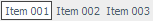
Simple ModeList:
ModeList_1.gif
Advanced ModeList:
ModeList_2.gif
ModeList with horizontal rendering:
ModeList_3.gif
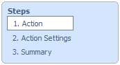
Disabled ModeList used to indicate steps in a wizard dialog:
ModeList_4.png
You must be a registered user to add a comment. If you've already registered, sign in. Otherwise, register and sign in.
Alfresco Content Services Hub Docs
Ask for and offer help to other Alfresco Content Services Users and members of the Alfresco team.
Related links:
Latest Articles
- Alfresco Community Edition 201911 GA Release Notes
- Alfresco Community Edition 201910 EA Release Notes
- Deconstructing SOLR Indexes
- Alfresco Community Edition 201901 GA Release Notes
- Alfresco Community Edition 201808 EA file list
- php_upload.docx
- Alfresco Community Edition 201808 EA Release Notes
- Alfresco_6.0_docker deployment.pdf
- Alfresco Community Edition 201806 GA file list
- alfresco.log
- Alfresco Addons *Incomplete list*
- Alfresco Community Edition 201806 GA Release Notes
- AGS Benchmark Driver Documentation
- Default memory allocation issue in Alfresco CE 201...
- Alfresco Community Edition 201804 EA file list
We use cookies on this site to enhance your user experience
By using this site, you are agreeing to allow us to collect and use cookies as outlined in Alfresco’s Cookie Statement and Terms of Use (and you have a legitimate interest in Alfresco and our products, authorizing us to contact you in such methods). If you are not ok with these terms, please do not use this website.