
Share Header
Turn on suggestions
Auto-suggest helps you quickly narrow down your search results by suggesting possible matches as you type.
Showing results for
- Alfresco Hub
- :
- ACS - Hub Docs
- :
- Share Header
Share Header
- Subscribe to RSS Feed
- Mark as New
- Mark as Read
- Bookmark
- Subscribe
- Printer Friendly Page
- Report Inappropriate Content
6 Jun 2015
0:40 AM
Obsolete Pages{{Obsolete}}
The official documentation is at: http://docs.alfresco.com
Table of Contents
Overview
The 3.4a release introduces the ability to customize the main header bar in the Share application via the share-config-custom.xml mechanism. The following describes what customizations are available and how to achieve them.
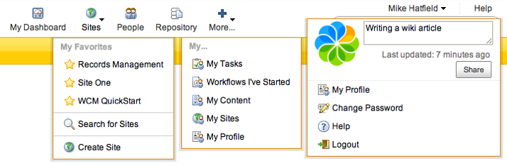
The default Share header for a non-admin user looks like:
frame|c|none|Default user header
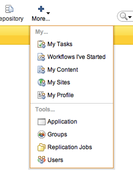
...an admin user also has access to the individual tools within the Share Admin Console:
frame|c|none|Default admin menu
Previously, these two different configurations were accomplished using some logic within the Freemarker template, which was tricky to find and extend. Version 3.4.a introduces a configuration-based header which is much easier to extend.
The header config reader is defined at the top of share-config.xml as:
<element-reader element-name='header' class='org.alfresco.web.config.header.HeaderElementReader'/>
Header Structure
The header bar in Share is constructed from four parts:
- the logo
- the application items (icon above, text below)
- the user items (text only, positioned above the search area)
- the search area
Application and User items can be static links, dynamic links or menus (more on those later). The configuration structure for these two types is exactly the same, but Share renders them differently. By default they are logically split into those items referring to the application (Sites, People, etc.) and the user (Profile, Change Password, etc.). This distinction is not enforced by the implementation, but is more a guide for a better user experience.
Logo
The logo is both themeable and replaceable via the i18n mechanism.

- {theme} is the current application theme, e.g. default, yellowTheme, etc.
- {logo} is the resolved i18n message header.logo, e.g. header.logo=app-logo.png in slingshot.properties
Application and User Items
Application header items refer to those to the left of the header area consisting of an icon and text, whereas User items are positioned above the search bar and are text only (due to the compressed spacing of user items, they do not support icons).
frame|c|left|Link item frame|c|none|Menu item
Search Area
The search box and dropdown are rendered as part of the header, but are not currently configurable.
Configuration
A default header has been defined in share-config.xml. In order to customise to your own needs, you need to replace the default structure in a share-config-custom.xml file in the Tomcat/shared/classes/alfresco/web-extension. See the notes in Install Tomcat6 to ensure extensions will be picked up.
Copy the entire <header>...</header> XML structure as follows, noting the replace='true' attribute:
<alfresco-config>
   <config replace='true'>
      <header>
         ...
      </header>
   </config>
</alfresco-config>
There are three sections to the header configuration:
- <app-items> and <user-items> to define each header section respectively.
- <dependencies> declares required client-side JavaScript and Stylesheet includes (e.g. for Sites menu)
In terms of configuration, there is no difference between the application and user items.
Item Config
An item is declared using an <item> node.
| Attribute | Mandatory | Description |
|---|---|---|
| type | yes | Item type. Can be one of:
|
| id | yes | Used to uniquely define the header item. Only needs to be unique within it's container. |
| icon | no | Image URL, relative to components/images/header/. If not supplied, an image named components/images/header/{id}.png will be rendered. |
| label | no | Label text or i18n property. If not supplied, an i18n message header.{id}.label will be rendered. |
| description | no | Description (hover state) text or i18n property. If not supplied, an i18n message header.{id}.description will be rendered. |
| permission | no | Currently only admin supported, which restricts the visibility of the link to members of the Administrators group. |
| condition | no | Any Freemarker expression that results in a boolean true or false value. The item will only be rendered if the condition is true. |
'link' and 'external-link' types
These, as their name would suggest, generate internal and external links (the difference being the external link type is rendered with target='_blank'). The link is specified within the node value and can be one of the following formats:
- Share page. Relative to the /page servlet, e.g. /my-tasks, /site/marketing/documentlibrary
- Full URL, e.g. http://www.google.co.uk/
- Share URI template or Help page, e.g. {userdashboardpage}, {share-help}
Examples:
<item type='link' id='marketing-doclib' label='Marketing' description='Marketing Document Library' icon='../filetypes/generic-folder-16.png'>/site/marketing/documentlibrary</item>
<item type='external-link' id='bbc' label='BBC News' description='' icon='../info-16.png'>http://news.bbc.co.uk/</item>
<item type='link' id='help'>{share-help}</item>'container' type
Must contain only <container-group> nodes. Container groups support the permission and condition attributes which are cascaded to all contained items.
| Attribute | Mandatory | Description |
|---|---|---|
| id | yes | Used to uniquely define the container group. Only needs to be unique within it's item parent. |
| label | no | Label text or i18n property. If not supplied, an i18n message header.{id}.label will be rendered. |
| permission | no | Currently only admin supported, which restricts the visibility of the contained items to members of the Administrators group. |
| condition | no | Any Freemarker expression that results in a boolean true or false value. The container will only be rendered if the condition is true. |
Examples:
<container-group id='tools' permission='admin'>
   <item type='link' id='application'>/console/admin-console/application</item>
   <item type='link' id='groups'>/console/admin-console/groups</item>
   <item type='link' id='replication-jobs'>/console/admin-console/replication-jobs</item>
   <item type='link' id='users'>/console/admin-console/users</item>
</container-group>
<container-group id='blogs' label='Blogs...'>
   <item type='external-link' id='mike' label='Mike Hatfield' description='' icon='../comment-16.png'>http://blogs.alfresco.com/wp/mikeh/</item>
   <item type='external-link' id='kev' label='Kevin Roast' description='' icon='../comment-16.png'>http://blogs.alfresco.com/wp/kevinr/</item>
   <item type='external-link' id='will' label='Will Abson' description='' icon='../comment-16.png'>http://blogs.alfresco.com/wp/wabson/</item>
</container-group>
'js' type
Renders a placeholder button which can then be 'taken over' by some client-side JavaScript implementation. The JavaScript class is specified in the node's value, e.g. Alfresco.module.Sites and its implementation must be declared via the <dependencies> tag (see below).
Example:
      <item type='js' id='sites'>Alfresco.module.Sites</item>
   ...
   <dependencies>
      <css src='/modules/create-site.css' />
      <css src='/modules/header/sites.css' />
      <js src='/modules/create-site.js' />
      <js src='/modules/header/sites.js' />
   </dependencies>
A header module is very similar to a standard Share module, but doesn't render it's own initial HTML mark-up. Upon instantiation, it's given the DOM ID of the element created as the placeholder. It's entirely up to the module to decide what to do with this existing element, but it's strongly recommended that it be rendered as a YUI Button widget to maintain consistency within the header.
See the Alfresco.module.Sites implementation in modules/header/sites.js for example code.
'user' type
The user type is a special case used to render the avatar and status update UI. It is intended to be used once as a sub-item of the user items menu. Any other use is unsupported at this time.
Dependency Config
The <dependencies> section supports the JavaScript item type. Client-side JavaScript and Stylesheet links should be defined here, which will be loaded as part of the header rendering sequence.
1 Comment
You must be a registered user to add a comment. If you've already registered, sign in. Otherwise, register and sign in.
Alfresco Content Services Hub Docs
Ask for and offer help to other Alfresco Content Services Users and members of the Alfresco team.
Related links:
Latest Articles
- Alfresco Community Edition 201911 GA Release Notes
- Alfresco Community Edition 201910 EA Release Notes
- Deconstructing SOLR Indexes
- Alfresco Community Edition 201901 GA Release Notes
- Alfresco Community Edition 201808 EA file list
- php_upload.docx
- Alfresco Community Edition 201808 EA Release Notes
- Alfresco_6.0_docker deployment.pdf
- Alfresco Community Edition 201806 GA file list
- alfresco.log
- Alfresco Addons *Incomplete list*
- Alfresco Community Edition 201806 GA Release Notes
- AGS Benchmark Driver Documentation
- Default memory allocation issue in Alfresco CE 201...
- Alfresco Community Edition 201804 EA file list
We use cookies on this site to enhance your user experience
By using this site, you are agreeing to allow us to collect and use cookies as outlined in Alfresco’s Cookie Statement and Terms of Use (and you have a legitimate interest in Alfresco and our products, authorizing us to contact you in such methods). If you are not ok with these terms, please do not use this website.