
Progressive Panel
Turn on suggestions
Auto-suggest helps you quickly narrow down your search results by suggesting possible matches as you type.
Showing results for
- Alfresco Hub
- :
- ACS - Hub Docs
- :
- Progressive Panel
Progressive Panel
- Subscribe to RSS Feed
- Mark as New
- Mark as Read
- Bookmark
- Subscribe
- Printer Friendly Page
- Report Inappropriate Content
6 Jun 2015
0:40 AM
Obsolete Pages{{Obsolete}}
The official documentation is at: http://docs.alfresco.com
JSF Component
Back to Component Library
Table of Contents
Progressive Panel
General Description
The progressive panel component enables the user to hide/show areas of the UI to progressive display more complex areas of the UI as required. It also allows the developer to surround an area of the UI with an attractive graphical border and title label. The component tags can contain any combination of HTML or child JSF components. IMPORTANT NOTE: Currently there is an issue in the SunRI and MyFaces impl of JSF whereby all child components of the panel must have an id attribute specified if a progressive style panel is used - else an exception will occur when the panel visibility is toggled by the user! The IDs are not required if the progressive attribute is set to false.
Tag details
<string>' MANDATORY
  rendered='<boolean>'
  styleClass='<string>'
  style='<string>'
  border='<string>'
  bgcolor='<string>'
  progressive='<boolean>'
  expanded='<boolean>'
  label='<string>'
  titleBorder='<string>'
  titleBgcolor='<string>'
  linkLabel='<string>'
  linkIcon='<string>'
  linkTooltip='<string>'
  linkStyleClass='<string>'
  expandedActionListener='<method-binding>'
/>
Custom tag attributes
border - specifies the well known name of a set of border image files that will be used to create the graphical edges of the panel. The currently available border image sets include: ballongrey, ballonwhite, blue, buttonboxgrey, greyround, innergrey, mainwhite, salmon, white, yellow and yellowInner. See Linton or Kevin for more details on the image sets. No border images will be displayed if this value is not set.
bgcolor - the HTML background colour value to use for the background of the panel area. The default is white if this value is not set.
progressive - set true to allow the panel contents to be made hidden/visible by the user. The default value is false.
expanded - set the initial expanded state of the panel. Default is true so the panel is open by default.
label - the title label to display in the top left of the panel area.
titleBorder - border image set to use for the upper title area if any. This attribute is used to add an additional title area border as well as the outer border. See #Screenshots below.
titleBgcolor - the HTML background colour value to use for the background of the optional upper title area. The default is white if this value is not set.
linkLabel - if present, the panel will generate a link in the top right of the title area of the panel. When clicked the link will fire the action associated with the panel.
linkIcon - if present, the panel will generate an icon in the top right of the title area of the panel. When clicked the link will fire the action associated with the panel.
linkTooltip - tooltip text to use for the linkIcon.
linkStyleClass - CSS class to apply to the linkLabel.
action - command outcome action value used when the user cliks the text or icon generated by the linkLabel or linkIcon attributes.
actionListener - command listener method binding used when the user clicks the text or icon generated by the linkLabel or linkIcon attributes.
Example
   <a:panel id='panel1' border='mainwhite' bgcolor='white' progressive='true'
      label='Progressive Panel'>
      nothing exciting here
      Any HTML you like here

      <h:outputText id='text1' value='#{msg.value}'/>
      <p>
      <h:commandButton id='but1' value='Test Button' action='success' />
   </a:panel>
<pre>
  <a:panel id='panel2' border='white' titleBorder='blue' titleBgcolor='#D3E6FE' bgcolor='white'
     action='editPanelProps' actionListener='#{Bean.method}'
     linkIcon='/images/edit.gif' progressive='true' label='Progressive Panel 2'>
     Any HTML you like here as before
  </a:panel>
Screenshots
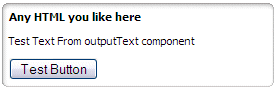
Shows a progressive panel with a blue border and a title label wrapping a RichList component:
Panel_1.gif
The same panel after the user has clicked the small arrow icon to hide the panel contents:
Panel_2.gif
A simple non-progressive panel without a title label, showing a nice white bevelled border:
Panel_3.gif
A more complex progressive panel with a title border and linkIcon in the top right of the title area:
Panel_4.png
You must be a registered user to add a comment. If you've already registered, sign in. Otherwise, register and sign in.
Alfresco Content Services Hub Docs
Ask for and offer help to other Alfresco Content Services Users and members of the Alfresco team.
Related links:
Latest Articles
- Alfresco Community Edition 201911 GA Release Notes
- Alfresco Community Edition 201910 EA Release Notes
- Deconstructing SOLR Indexes
- Alfresco Community Edition 201901 GA Release Notes
- Alfresco Community Edition 201808 EA file list
- php_upload.docx
- Alfresco Community Edition 201808 EA Release Notes
- Alfresco_6.0_docker deployment.pdf
- Alfresco Community Edition 201806 GA file list
- alfresco.log
- Alfresco Addons *Incomplete list*
- Alfresco Community Edition 201806 GA Release Notes
- AGS Benchmark Driver Documentation
- Default memory allocation issue in Alfresco CE 201...
- Alfresco Community Edition 201804 EA file list
We use cookies on this site to enhance your user experience
By using this site, you are agreeing to allow us to collect and use cookies as outlined in Alfresco’s Cookie Statement and Terms of Use (and you have a legitimate interest in Alfresco and our products, authorizing us to contact you in such methods). If you are not ok with these terms, please do not use this website.