ADF Theming
- Alfresco Hub
- :
- ADF - Forum
- :
- ADF Theming
ADF Theming
- Subscribe to RSS Feed
- Mark as New
- Mark as Read
- Bookmark
- Subscribe
- Printer Friendly Page
- Report Inappropriate Content
- ADF Theming
- 1. Generation of an ADF project using the Yeoman ADF app generator
- 2. Choose the colors
- 3.Change the theme.scssfile
- 4. Dark theme
- Using a pre-built theme
ADF Theming
One of the first questions that I receive often when someone starts to play with ADF is how to customize the colors after generated an app.
In order to help all the developer to easily accomplish this task in the version 1.8.0 of ADF we have introduced a theming capability.
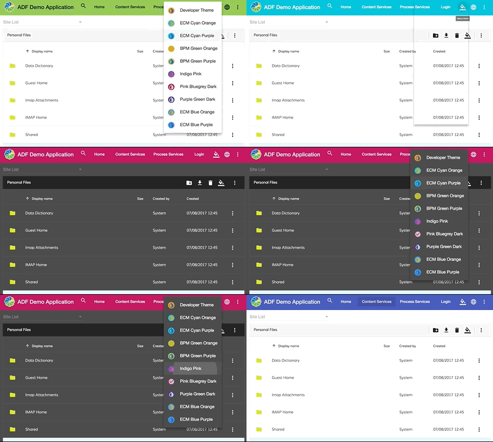
Before to completely dive on how to create your custom colors in ADF I would like to add a bit of context. ADF is a framework based on Angular and Material design.
Material design brings inside a lot of guidelines on how to style your applications and one of this guidelines is about the colors.
In Material Design there are mainly two colors to consider:
- primary color refers to a color that appears most frequently in your app.
- accent color refers to a color used to accent key parts of your UI. The accent should be used for the floating action button and interactive elements, such as : text fields and cursors, text selection, progress bars, selection controls, buttons, and sliders.
Starting from that two colors we fill in the spectrum to create a complete palette:
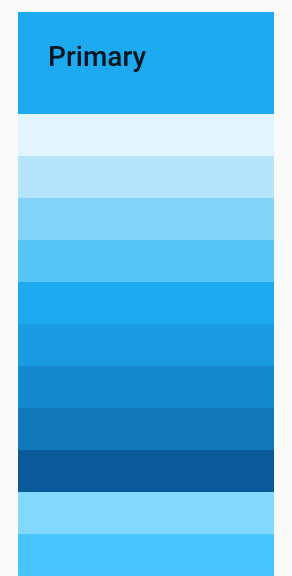
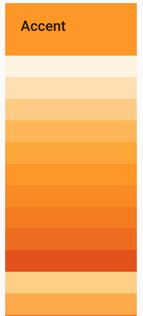
All these different shades of primary/accent color are used to create a contrast between elements, you can use lighter or darker tones of your primary/accent color.
If you want more information about Material design colors please refer to the official guidelines color documentation.
Now that we have a common understanding of how material design colors works let's give a look on how to customize it in ADF.
You can find this example in the folder belonging to the 1.9.0 projects in the ADF examples repo.
1. Generation of an ADF project using the Yeoman ADF app generator
Nothing to describe here. In case of our planned modifications, you should have a similar project, you can find the generator at this address
2. Choose the colors
If you search on google material design palette generator you will see a lot of results fell free to use the one that you like. I used this one Material Design Theme & Palette Color Generator . Once you have chosen the color that you like you will have something like that:
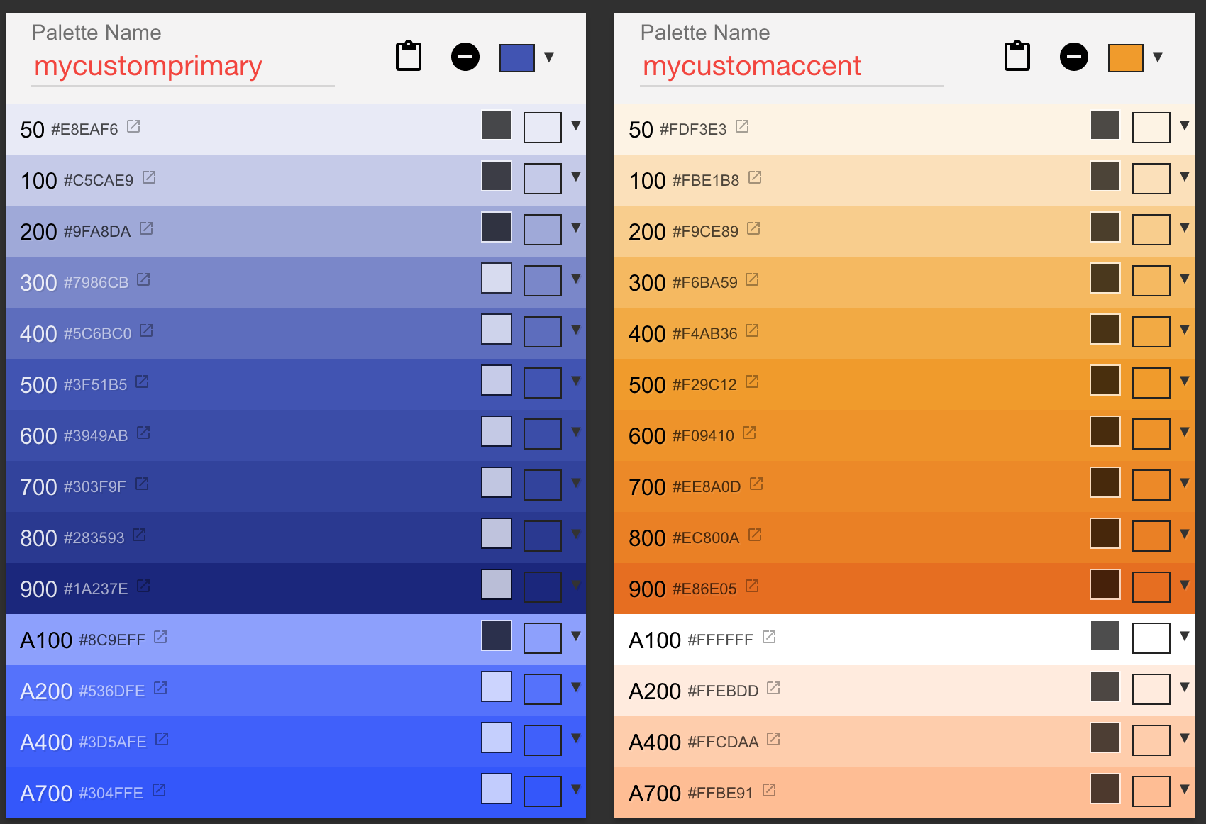
In order to use this colors we need to export it as Material2 palette:
$md-mycustomprimary: (
50 : #e8eaf6,
100 : #c5cae9,
200 : #9fa8da,
300 : #7986cb,
400 : #5c6bc0,
500 : #3f51b5,
600 : #3949ab,
700 : #303f9f,
800 : #283593,
900 : #1a237e,
A100 : #8c9eff,
A200 : #536dfe,
A400 : #3d5afe,
A700 : #304ffe,
contrast: (
50 : #000000,
100 : #000000,
200 : #000000,
300 : #ffffff,
400 : #ffffff,
500 : #ffffff,
600 : #ffffff,
700 : #ffffff,
800 : #ffffff,
900 : #ffffff,
A100 : #000000,
A200 : #ffffff,
A400 : #ffffff,
A700 : #ffffff,
)
);
$md-mycustomaccent: (
50 : #fdf3e3,
100 : #fbe1b8,
200 : #f9ce89,
300 : #f6ba59,
400 : #f4ab36,
500 : #f29c12,
600 : #f09410,
700 : #ee8a0d,
800 : #ec800a,
900 : #e86e05,
A100 : #ffffff,
A200 : #ffebdd,
A400 : #ffcdaa,
A700 : #ffbe91,
contrast: (
50 : #000000,
100 : #000000,
200 : #000000,
300 : #000000,
400 : #000000,
500 : #000000,
600 : #000000,
700 : #000000,
800 : #000000,
900 : #000000,
A100 : #000000,
A200 : #000000,
A400 : #000000,
A700 : #000000,
)
);
3. Change the theme.scss file
Copy and paste your palette colors variables in the /src/custom-style.scss and use it in:
$primary: mat-palette($md-mycustomprimary);
$accent: mat-palette($md-mycustomaccent);
$warn: mat-palette($alfresco-warn);
$theme: mat-light-theme($primary, $accent, $warn);
@include angular-material-theme($theme);
@include adf-content-services-theme($theme);
@include adf-process-services-theme($theme);
@include adf-core-theme($theme);
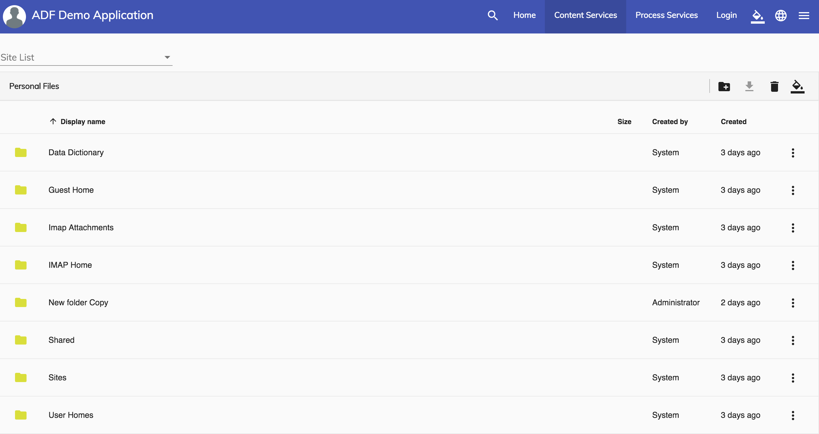
now you can start your app and if everything goes ok you should have the following result:
4. Dark theme
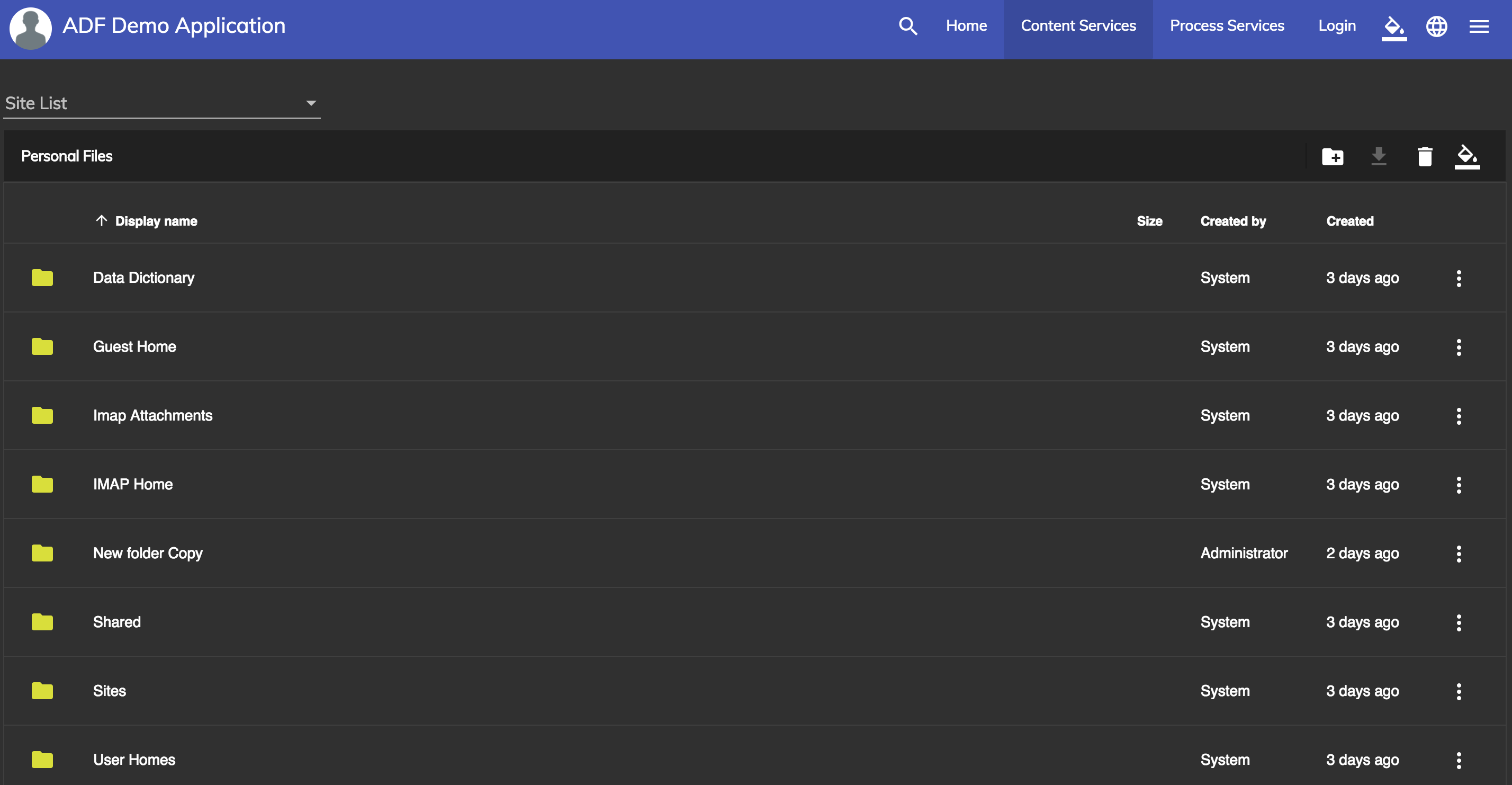
A possible variation on the theming is creating a dark theme. Open the /src/custom-style.scss and replace the following line:
$theme: mat-light-theme($primary, $accent, $warn);
with:
$theme: mat-dark-theme($primary, $accent, $warn);
Will generate the following result:
Using a pre-built theme
Another possibility instead to create your custom colors uses the pre-built theme. ADF comes prepackaged with several pre-built theme CSS files. These theme files also include all of the styles for core (styles common to all components), so you only have to include a single CSS file for Angular Material in your app.
You can include a theme file directly into your application from ng2-alfresco-core/prebuilt-themes
Available pre-built themes:
adf-blue-orange.cssadf-blue-purple.cssadf-cyan-orange.cssadf-cyan-purple.cssadf-green-orange.cssadf-green-purple.cssadf-indigo-pink.cssadf-pink-bluegrey.cssadf-purple-green.css
If you're using Angular CLI you can include one of the prebuilt themes in your styles.css file:
@import '~ng2-alfresco-core/prebuilt-themes/adf-blue-orange.css';
Or you can add it directly in your index.html
<link href="node_modules/ng2-alfresco-core/prebuilt-themes/adf-blue-orange.css" rel="stylesheet">
If you want more information about theming you can check our official documentation and if you have more questions, please reply here or contact us using gitter.
You must be a registered user to add a comment. If you've already registered, sign in. Otherwise, register and sign in.
Blog posts and updates about Application Development Framework (ADF).
- Extending the Alfresco Digital Workspace (ADW)
- Developing Take Ownership Extension for ACA 2.8.0
- Creating your first extension for Alfresco Content...
- ADF 4.0.0 is out!
- Hey Front-End Developer, what are your preferred o...
- We want to (thank and) reward our ADF contributors...
- How to update ADF from version 2.5.0 to 2.6.1
- Application Development Framework (ADF) 2.6.1 Rele...
- ADF 2.6.0 Release Note
- How to update ADF from version 2.4.0 to 2.5.0
- ADF 2.5.0 Release Note
- ADF 2.4.0 Release Note
- How to deploy an ADF APP
- How To Add The New Sidenav Layout Component In You...
- How to integrate ADF log service with Mixpanel an...
We use cookies on this site to enhance your user experience
By using this site, you are agreeing to allow us to collect and use cookies as outlined in Alfresco’s Cookie Statement and Terms of Use (and you have a legitimate interest in Alfresco and our products, authorizing us to contact you in such methods). If you are not ok with these terms, please do not use this website.
