
Responsive design (ADF 107)
Turn on suggestions
Auto-suggest helps you quickly narrow down your search results by suggesting possible matches as you type.
Showing results for
- Alfresco Hub
- :
- ADF - Forum
- :
- Responsive design (ADF 107)
Responsive design (ADF 107)
- Subscribe to RSS Feed
- Mark as New
- Mark as Read
- Bookmark
- Subscribe
- Printer Friendly Page
- Report Inappropriate Content
27 Feb 2017
4:29 PM
After a detailed overview of the available services and components of the Alfresco Application Development Framework, in this tutorial we are going to talk more about responsiveness. We would like here to remember that Alfresco Application Development Framework (from now on ADF) is provided by Alfresco as Open Source, to build custom applications on top of the Activiti BPM Engine and Alfresco ECM Repository.
We won’t introduce here the basis of the Alfresco ADF, because we would like to focus the content on customising an existing ADF application. To better describe the tasks, we are going to use “a step by step“ approach, more practical and easy to follow for our goal.
For further details about the Alfresco ADF, please refer to the alfresco-ng2-components GitHub Project and take a look to the Alfresco Catalog, with a friendly (and technical) overview of all the available components. For requests of support, questions and feedback, don’t forget to participate to the Community of Developers dedicated to the ADF or to the Gitter space dedicated to the Alfresco Angular 2 components.
Introduction about responsive web design
“Designing responsive applications” in software development has been a buzzword for some years in the recent past, and we are pretty sure you have heard about it at least one time. To be all on the same page, we would prefer to begin from some very basic concepts, for a better understanding of how Alfresco ADF implements it and the advantages in development. For this purpose, let’s start from the definition of “responsive web design” on Wikipedia.
“Responsive web design (RWD) is an approach to web design aimed at allowing desktop webpages to be viewed in response to the size of the screen or web browser one is viewing with. A site designed with RWD adapts the layout to the viewing environment by using fluid, proportion-based grids, flexible images, and CSS3 media queries, an extension of the @media rule...”
(Wikipedia: Responsive web design)
As you can read above, responsive web design and Cascading Style Sheets (CSS) are strictly related and the adoption of a CSS framework is crucial and affects the look and feel of the resulting application. Again from Wikipedia, let’s quote a core concept from the CSS framework’s definition.
“... Most of these frameworks contain at least a grid. More functional frameworks also come with more features and additional JavaScript based functions, but are mostly design oriented and unobtrusive. This differentiates these from functional and full JavaScript frameworks.”
In the next paragraph we are going to see how Alfresco ADF looks like on different devices and layouts and then we will discuss the technical details, mainly based on the introduction of the Google Material Design framework.
The Alfresco ADF responsive UI
Assuming you have an Alfresco ADF application up and running, developed as described in ADF 101, in this paragraph we are going to see how the web application looks like on different devices and layouts. Before viewing some samples, a crucial topic is about the tools to support and test the development.
One of the most easier (and free of charge) tool to test a generic web application on different devices and layouts, is the web browser. All the most used and modern browsers have a “Responsive Design Mode”, giving to the developer a simple and smart path for a first test and look.
Warning: The “Responsive Design Mode” gives you a close approximation as to how your site will look on a mobile device, but to get the full picture you should always test your site on real devices. Things like performances, exact rendering, etc. are only examples of possible critical issues your browser could hide, respect to a real and physical device.
In our precise case, we would like to share some further details on the Mozilla Firefox Responsive Design Mode and the Google Chrome DevTools' Device Mode. Both give you a simple way to simulate factors like: screen size, pixel density of the display and touch. All of them, with a very straightforward interface immediately available into your preferred browser. From now on, every screenshot and test has been captured using Mozilla Firefox Responsive Design Mode, on version 51.0.1 (64 bit) for Ubuntu.
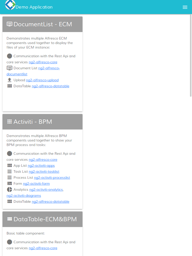
Now that we know how to test our Alfresco ADF application on different devices, let’s see how the home page looks like, in a laptop, a tablet and a mobile cell phone with a low resolution.

Home of the Alfresco ADF application on a laptop (1280x768).

Home of the Alfresco ADF application on a tablet (768x1024).

Home of the Alfresco ADF application on a mobile cell phone with low resolution (360x640).
As another example, let’s see the login page on the same different layouts: a laptop, a tablet and a mobile cell phone with a low resolution. Below some screenshots showing how the pages look like.
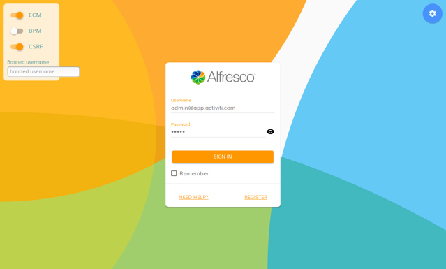
Login page of the Alfresco ADF application on a laptop (1280x768).

Login page of the Alfresco ADF application on a tablet (768x1024).
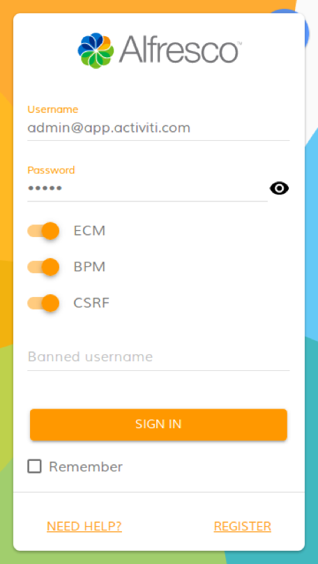
Login page of the Alfresco ADF application on a mobile cell phone with low resolution (360x640).
In all the cases, the application is always the same and no further customisation is required to manage the different presentations.
How Alfresco ADF implements the responsive UI
Now that we know the behaviour of the responsive User Interface of an Alfresco ADF application, in this paragraph we are going to describe the technical solution used behind the scenes: firstly, introducing the technology and then describing how it is used into an Alfresco ADF application.
Introduction to the Material Design Lite
As introduced in a previous tutorial, Alfresco ADF is designed and developed to work with the Google Material Design, in particular with Material Design Lite. Below some quoted parts of the official website for further explanation and understanding.
“Material Design Lite lets you add a Material Design look and feel to your websites. It doesn’t rely on any JavaScript frameworks and aims to optimise for cross-device use, gracefully degrade in older browsers, and offer an experience that is immediately accessible. Get started now.
The MDL components are created with CSS, JavaScript, and HTML. You can use the components to construct web pages and web apps that are attractive, consistent, and functional. Pages developed with MDL will adhere to modern web design principles like browser portability, device independence, and graceful degradation.
The MDL component library includes new versions of common user interface controls such as buttons, check boxes, and text fields, adapted to follow Material Design concepts. The library also includes enhanced and specialised features like cards, column layouts, sliders, spinners, tabs, typography, and more. MDL is free to download and use, and may be used with or without any library or development environment (such as Web Starter Kit). It is a cross-browser, cross-OS web developer's toolkit that can be used by anyone who wants to write more productive, portable, and — most importantly — usable web pages.”
(Quoted from: https://getmdl.io/)
We won’t discuss here the basis of that design language. If you want to learn more about it, you can start from the Official Documentation and go through the library and styles, for a better understanding.
How Alfresco ADF uses Material Design Lite
From a technical point of view, the relevant thing we are interested to share, is that every ADF application is designed according to Material Design Lite. And for this reason in particular, all the ADF application are natively responsive. For a technical point of view, this means:
In the
index.htmlfile you can find the inclusions for Material Design Lite in terms of Cascading Style Sheets. Below a portion of theindex.htmlfile of themy-adfapplication.
<!-- Google Material Design Lite -->
<link href="css/material.orange-blue.min.css" rel="stylesheet">
<script src="js/material.min.js"></script>
<link href="css/iconfont/material-icons.css" rel="stylesheet">
Each ADF component generates the HTML portion, according to the Material Design components. You can find the HTML template in the
*.component.htmlfile of each folder containing an ADF component.
Each ADF component can have a customized stylesheet declared into the
*.component.cssfile. If you check into themy-adfapplication, in particular into each folder containing an ADF component, you can find a*.component.cssfile (for example inactiviti,files,home,login,setting) or you cannot find it, if the default Material Design Lite stylesheet is enough (for example in about, search). Those*.component.cssfiles are exactly the place where we are going to act to customize the colors and stylesheet in general.
As an example, let’s view below a portion of the home.component.html file (stored into the <my-adf>/app/components/home folder) showing some Material Design Lite classes together with some custom classes, used in our particular case to render the previous screenshots.
<div class="demo-card-square mdl-card mdl-shadow--2dp home-cards">
  <div class="mdl-card__title mdl-card--expand" routerLink="/files">
    <h2 class="mdl-card__title-text">
      <i class="material-icons home--card__icon">dvr</i>
      <span>DocumentList - ECM</span>
    </h2>
  </div>
  <div class="mdl-card__supporting-text">
    Demonstrates multiple Alfresco ECM...
Following, the description of some custom CSS classes for the home component, stored into the home.component.css file of the <my-adf>/app/components/home folder.
.home-cards {
    float: left;
    margin: 10px 10px 10px 10px;
}

.mdl-card__supporting-text {
    display: block;
    overflow-y: auto;
    height: 400px;
}
Customising the responsive layout
To show in practice the importance of the Cascading Style Sheets (CSS), let’s change a very small thing into the home.component.css file and see how the responsive behaviour will be affected. Below the changes to the CSS file (stored into the <my-adf>/app/components/home folder).
.home-cards {
    /* float: left; Comment this! */
    margin: 10px 10px 10px 10px;
}
Saving the home.component.css file, you will see that the application will be updated automatically. Below a picture showing how the home view looks like after restarting and how the rendering changes significantly in a tablet device.
Home of the Alfresco ADF application on a tablet (768x1024) with custom CSS.
This is, of course, a very simple example showing how it is possible to customise and control the Cascading Style Sheets (CSS) into an Alfresco ADF application and how it is possible to customise and control the behaviour as a consequence.
Disclaimer
All the content available in this tutorial has been developed and tested using Alfresco ADF v1.1.0 LA release. Below the full list of platforms, languages, frameworks and tools used here.
- Linux Ubuntu 16.04.01 LTS as Operating System.
- Activiti Enterprise Edition 1.5.2.1 release for Linux (running on port 9999).
- Node.js version 6.9.4.
Each variation to the listed versions and tools could affect the success of the tutorial, even if the involved technologies and tasks have been defined to be as more general as possible, not related to any specific context or platform. Please let us know for any issue or problem, requesting for support into the Community Portal dedicated to the Alfresco ADF or to the Gitter space dedicated to the Alfresco Angular 2 components.
Conclusion
In this tutorial we talked about responsive User Interface using the Alfresco Application Development Framework (named also Alfresco ADF). The Alfresco ADF is provided by Alfresco as Open Source, to build custom applications on top of the Activiti BPM Engine and Alfresco ECM Repository. For further details about the Alfresco ADF, please refer to the alfresco-ng2-components GitHub Project and take a look to the Alfresco Catalog, with a friendly (and technical) overview of all the available components. For requests of support, questions and feedback, don’t forget to participate to the Community of Developers dedicated to the ADF or to the Gitter space dedicated to the Alfresco Angular 2 components.
Labels
You must be a registered user to add a comment. If you've already registered, sign in. Otherwise, register and sign in.
Application Development Framework Blog
Blog posts and updates about Application Development Framework (ADF).
Latest Articles
- Extending the Alfresco Digital Workspace (ADW)
- Developing Take Ownership Extension for ACA 2.8.0
- Creating your first extension for Alfresco Content...
- ADF 4.0.0 is out!
- Hey Front-End Developer, what are your preferred o...
- We want to (thank and) reward our ADF contributors...
- How to update ADF from version 2.5.0 to 2.6.1
- Application Development Framework (ADF) 2.6.1 Rele...
- ADF 2.6.0 Release Note
- How to update ADF from version 2.4.0 to 2.5.0
- ADF 2.5.0 Release Note
- ADF 2.4.0 Release Note
- How to deploy an ADF APP
- How To Add The New Sidenav Layout Component In You...
- How to integrate ADF log service with Mixpanel an...
We use cookies on this site to enhance your user experience
By using this site, you are agreeing to allow us to collect and use cookies as outlined in Alfresco’s Cookie Statement and Terms of Use (and you have a legitimate interest in Alfresco and our products, authorizing us to contact you in such methods). If you are not ok with these terms, please do not use this website.